Discover the
Modern
WordPress with WordVell

Chartify Review: WordPress Plugin to Create Stunning Charts & Graphs without Coding
The human brain processes visuals around 60,000 times faster than text, and 90% of information transmitted to the brain is visual. (Source: MIT & University of Minnesota research)
That’s why Visual charts consistently outperform plain tables and text for explaining data.
Yet most website owners still struggle:
- How to build and add beautiful charts in WordPress that don’t look outdated?
- How to update data automatically without editing the post every single time?
- How to connect charts with Google Sheets or a live database if you’re not a developer?
Here, Chartify enters the chat. It is a no-code WordPress chart builder built for data-backed creators.
In this in-depth Chartify review, we break down whether this no-code WordPress chart plugin actually lives up to that promise.
You’ll see what features are available in the free version, what the Pro plan unlocks, what chart types & input data sources are supported, how easy it is to create your first chart, what the pricing is, and how Chartify compares with popular alternatives like WPdatatables and Visualizer.
So that you can confidently decide whether Chartify is the right charting plugin for your site or not.
What is the Chartify WordPress Plugin?
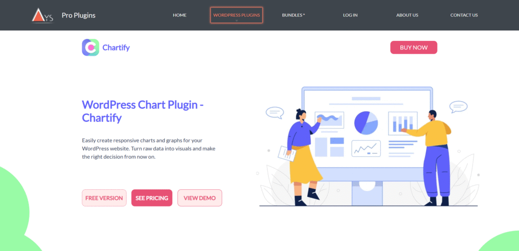
Chartify is a WordPress plugin built by Ays Pro, the same team behind well-known tools like Quiz Maker and Survey Maker.
So, this isn’t a random experimental plugin.
It comes from a company that already understands data, analytics, and user experience inside WordPress.
At its core, Chartify helps you turn raw numbers into meaningful visuals.
Want a simple bar chart? Done.
Need live data that updates itself? Yes, it is possible.
You can feed data into charts in three practical ways:
- Manual table input, which is perfect for quick stats
- File upload in various formats to input large data instantly
- Google Sheets sync, which allows charts to auto-update when the sheet changes (Pro)
- Direct database query that is ideal for apps and analytics dashboards (Pro)
One thing we personally appreciate: Chartify is powered by Google Charts and Chart.js.
That means charts load fast, respond well on every device, and work smoothly across browsers.
No weird rendering issues.
It’s designed for non-developers, but powerful enough that developers won’t feel limited.
If that’s what it is, next, let’s see what types of charts you can build with it.
Supported Chart Types (Free vs Pro)
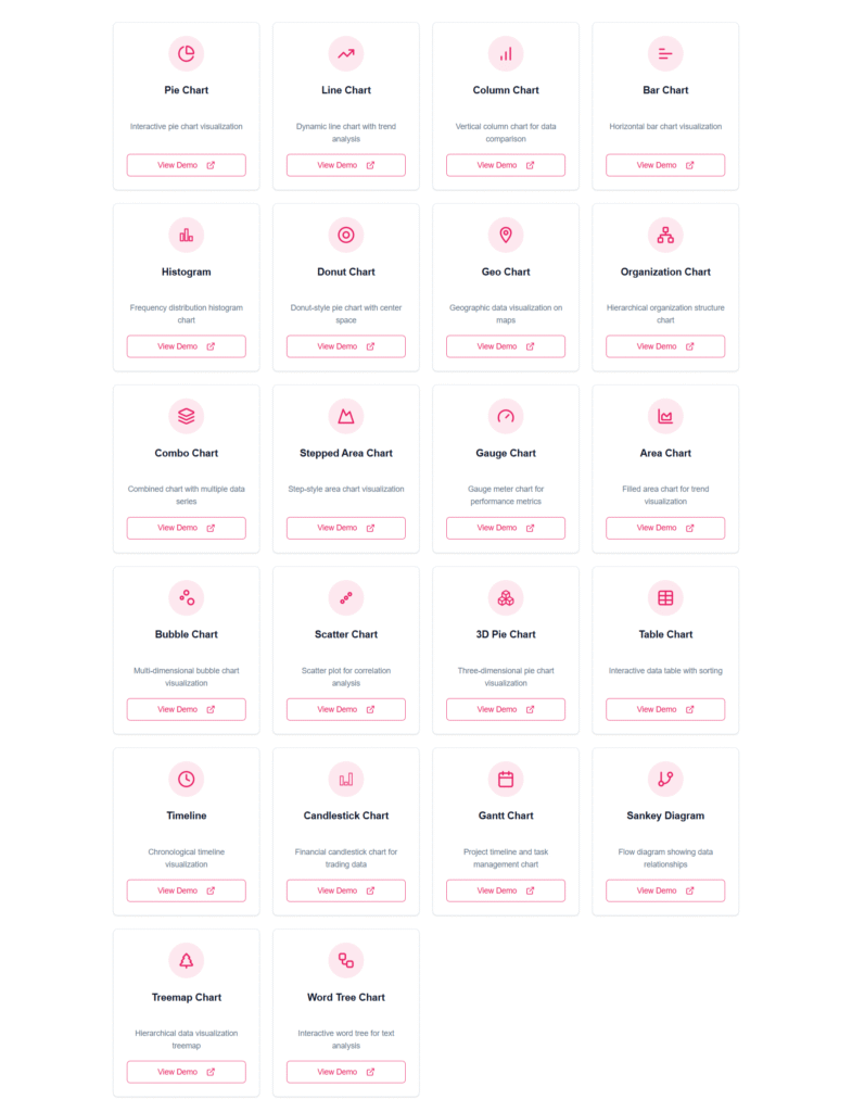
Chartify gives you a solid set of chart options from day one.
Even the free version covers the basics that most bloggers and small business owners need.
But the real power shows up when you unlock the Pro license.
Here’s the clarity every buyer wants:
| Chart Type | Free | Pro |
|---|---|---|
| Line / Bar / Column | ✅ | ✅ |
| Pie / Donut | ✅ | ✅ |
| Org Chart | ✅ | ✅ |
| Histogram / Geo Chart | ❌ | ✅ |
| Combo / Area / Scatter / Bubble | ❌ | ✅ |
| Timeline / Candlestick / Gantt / Sankey / Treemap / WordTree | ❌ | ✅ |
| 3D Pie | ❌ | ✅ |
More advanced categories, such as Candlestick, are handy for financial or stock market analytics.
Tools like Geo Maps and Treemaps help NGOs, schools, and businesses communicate performance and social impact in a more powerful way.
This variety tells us something important.
Chartify isn’t “just another bar chart plugin.” It scales from simple blog visuals to advanced analytical dashboards, depending on what your website needs.
Next up, let’s uncover what makes Chartify stand out beyond just its chart list.
Key Features: What Makes Chartify Stand Out
These are some of the prominent features of the Chartify WordPress Plugin. Let’s take a look:
1. Input Data Sources

Most chart plugins give you one or two ways to enter data. Chartify gives you four. And each serves a different type of WordPress user.
Manual Data Input
Perfect when you just want to plug in a few numbers and hit publish.
No spreadsheets required. Straight to the point.
File Upload (Pro)
If you already organize your data in spreadsheets, you don’t need to rebuild anything.
Just upload a CSV, and the chart is ready.
Import once → display everywhere.
Google Sheets Sync (Pro)
This is where Chartify becomes more than a plugin.
Imagine publishing a post today, and your chart refreshes itself next month when your data changes in Sheets.
No editing posts. No republishing.
It feels like magic, especially for businesses tracking performance.
SQL / Database Queries (Pro)
For developers and serious data users, you can link charts to live database tables.
If a sale happens or a quiz result is recorded, the chart updates automatically.
A mini-dashboard inside WordPress without building one from scratch.
2. Fully Responsive Layouts
Your charts auto-scale to different screens.
We tested on mobile, tablet, and large monitors.
No squished labels. No sideways scrolling. It works.
3. Chart Designing and Styling
Pick colors that match your brand. Adjust labels, legends, tooltips, and layout.
The free styling is good. The Pro styling is where creativity opens up.
4. Live Preview Inside Dashboard
You don’t have to publish to see what something looks like.
Every change instantly reflects in the preview. It saves time and mistakes.
5. Permission Controls
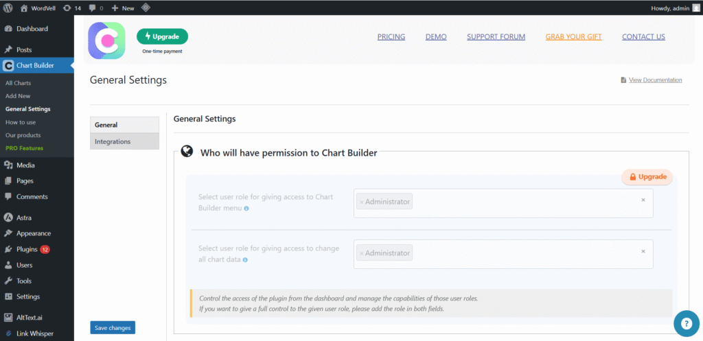
You can decide who sees what. Maybe only members should access analytics.
Or employees should view dashboards privately. Chartify makes that simple.
6. Easy Embedding Everywhere
It works with Gutenberg, Classic Editor, and most page builders.
Copy a shortcode. Paste it into a page, post, or widget.
You can also use their Gutenberg Block to embed your chart in a post.
7. Integration With AYS Quiz Maker
If you already use Quiz Maker, Chartify visualizes results in clean charts that learners understand instantly.
One ecosystem. One workflow.
Next, let’s talk about whether the free version is enough or if upgrading to Pro makes a real difference.
Chartify Free vs Premium: What You Actually Get
Not all users need automation or fancy visualizations.
Some just need a clean bar chart to make data easier to understand.
Chartify respects that difference, and the pricing model reflects it.
If you are a blogger, educator, or running a small site that occasionally uses charts, the Free version already delivers the essentials.
You can create common chart types, embed them anywhere, and even use them with the Quiz Maker plugin to show student or quiz results more clearly.
But if your website depends on dynamic or constantly changing data, the Pro plan is built for you.
Live sync from Google Sheets or your database means real-time accuracy without repetitive work.
That alone can pay for the upgrade over time.
Here’s the breakdown:
| Feature | Free | Pro |
|---|---|---|
| Chart Types | Basic Only | 20+ Advanced |
| Google Sheet Sync | ❌ | ✅ |
| Database Queries | ❌ | ✅ |
| File Upload (CSV) | ❌ | ✅ |
| Advanced Styling | Limited | Full |
| Quiz Maker Analytics | ✅ | ✅ (More Layouts + Design Options) |
| Priority Support | ❌ | ✅ |
So, the decision is simple:
Choose Free if:
You only need static charts and manual data entry.
Choose Pro if:
Your charts must update automatically, connect with live data, or look more polished.
This isn’t a case where the free version locks everything behind a paywall.
You can actually publish professional charts without spending a penny.
But the moment charts become part of your workflow, not just decoration, Pro becomes a reliable partner.
Next, we’ll walk through Chartify’s pricing, so you know exactly what you’ll pay depending on your website needs.
Pricing
Chartify keeps pricing simple and accessible, especially for WordPress users managing multiple websites.
| Plan | Price | Best For |
|---|---|---|
| Free | $0 | Testers, bloggers, small sites |
| Business | ~$49 / lifetime | Up to 5 websites |
| Developer | ~$129 / lifetime | Unlimited sites; ideal for studios and agencies |
These are lifetime licenses, which are rare in the WordPress ecosystem.
You pay once and keep creating charts forever.
Pricing may update over time, so always confirm the latest details on the official Ays Pro website before purchasing.
Next up: How to create your first chart using Chartify, step by step.
How to Create Your First Chart with Chatify (Step-by-Step)
Chartify is designed for beginners.
You don’t need coding skills or design experience.
Just follow this workflow once, and you’ll remember it forever.
Step 1: Create a New Chart
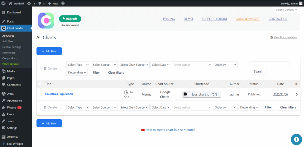
Go to WordPress Dashboard → Chartify → Add New.
It will open a Pop-up to choose further customizations.
Step 2: Choose Your Chart Type
Pick a chart rendering engine from Google Charts or Chart.js
Next, select the chart style, such as Bar, Line, or Pie, then click Next.
Chartify will load the editor with a default data structure.
Give your chart a title in the editor that reflects the data you’re showing.
Clear naming helps with future edits.
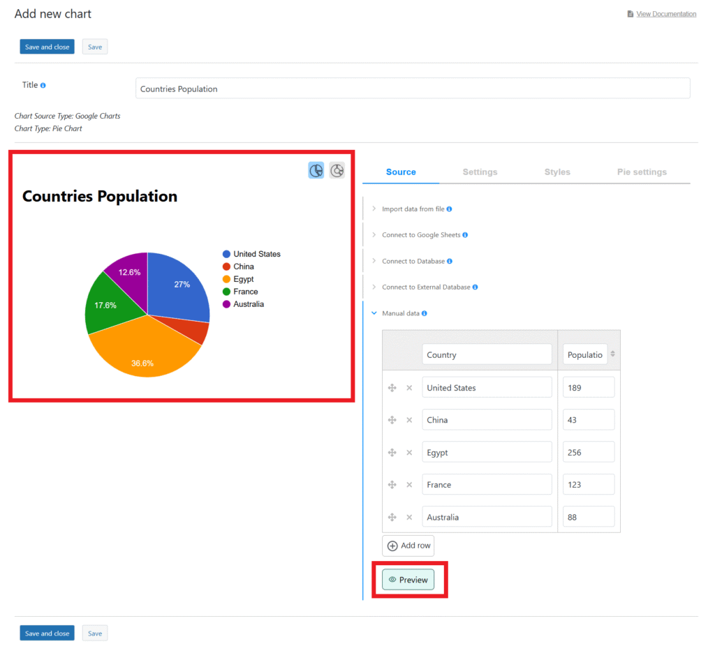
Step 3: Select the Data Source
Here, you decide how your data enters the chart. Options include:
- Manual Table Input (free)
- File Upload (CSV) (Pro)
- Google Sheets with auto-sync enabled (Pro)
- Database / SQL Query (Pro)
If you’re just testing, start with manual input.
Step 4: Add or Edit the Data in the Table
Fill rows and columns with your values.
You can add, remove, or reorganize data instantly.
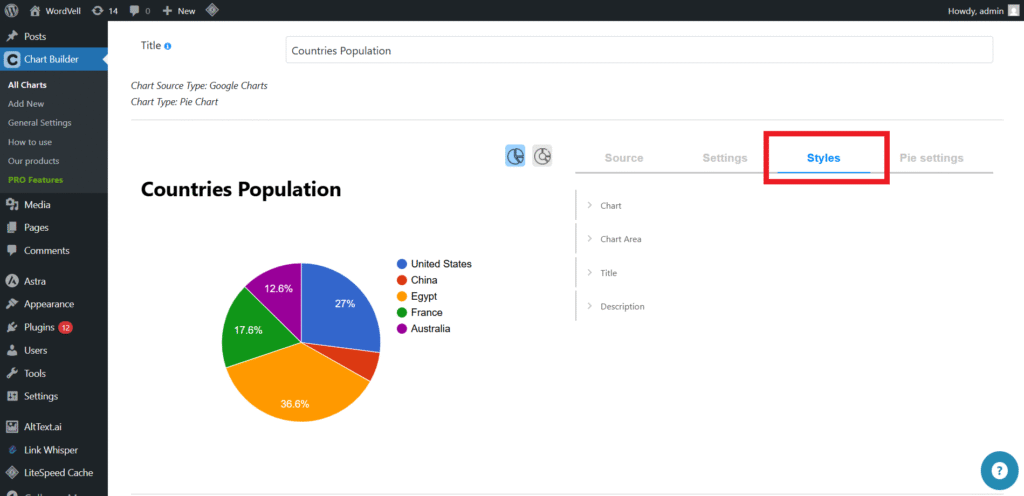
Step 5: Customize the Chart
Personalize the look and feel using the built-in design controls in the Styles Tab:
- Chart colors
- Axis labels and headings
- Tooltip details
- Legend visibility
- Font styles and spacing
Simple changes can make your chart match your brand perfectly.
Step 6: Live Preview
You can see the Live Preview of every adjustment update in real time.
No need to refresh or switch tabs.
Just Click the Preview Button.
It will show the live preview in the chart editor without moving anywhere else.
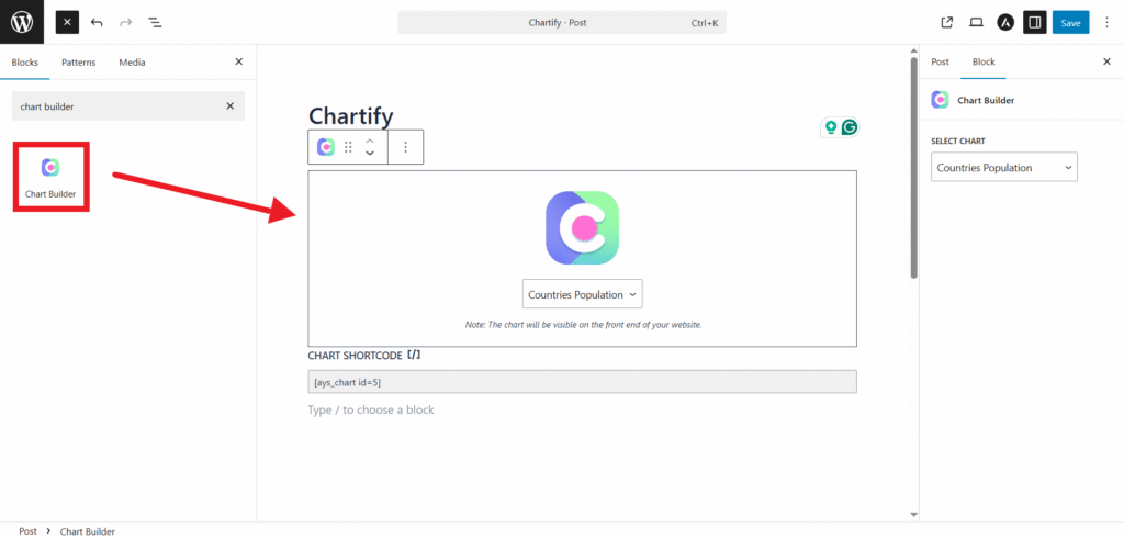
Step 7: Save and Embed
Click Save, then copy the generated shortcode, such as:
[ays_chart id="1"]
Paste it into any page, post, or widget, and update the page.
Alternatively, you can use their Gutenberg Block as well.
Your chart is now live on your site.
Bonus: Google Sheets Auto-Sync (Pro Feature)
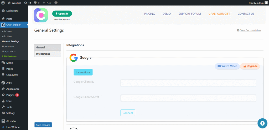
- Add your Google API Key inside the Chartify Integrations settings
- Click on Connect to establish the connection.
- Select the sheet and data range in the data source of your chart
Once set, changes made in Google Sheets appear on your website without editing the post again.
Next, we’ll share honest insights from performance testing to help you judge real-world usage.
Performance & User Experience Review
We tested Chartify on multiple WordPress setups. The results were reassuring.
The plugin loads only what’s needed for charts, keeping the site fast.
Google Charts handles the rendering in the browser, so charts feel smooth whether scrolling or interacting with tooltips.
Responsiveness is strong. On mobile, labels adjust well. On tablets and large screens, the charts resize without stretching or breaking.
You can also design your chart and chart area as per your brand colours.
For general websites, the performance is more than reliable.
Its user interface inside WordPress is simple. Live Preview reduces trial-and-error frustrations, especially for beginners.
Limitations
There are limitations worth knowing.
Because it relies on Google scripts, scripts must load from external servers.
If you want fully self-hosted rendering, this plugin isn’t built for that.
And while Pro supports live data, it’s not a replacement for complex BI dashboards with server-side logic.
For most content-driven WordPress sites, the speed and usability hit the right balance.
Ideal Use Cases: Who Should Choose Chartify?
Chartify fits best where data needs to be understood quickly without technical complexity.
If your WordPress content already includes statistics, performance numbers, or any kind of metrics, this tool turns them into visuals people actually pay attention to.
These are some audiences that can use this plugin:
| User Type | Why It’s Perfect |
|---|---|
| Teachers / Education Sites | Student score visualization |
| Business Reports | Live metric dashboards |
| Financial & Stock Sites | Candlestick charts (Pro) |
| Researchers & NGOs | Geo heatmaps |
| WooCommerce | Performance graphs, sales insights |
| News Media & Bloggers | Infographics to boost engagement |
| Quiz Maker Users | Quiz result visualization |
If your audience learns better visually, Chartify becomes a growth asset instead of just a design add-on.
Alternatives to Compare (Balanced Review)
No plugin exists in a vacuum, so it’s important to compare Chartify with others in the WordPress ecosystem.
Visualizer
Visualizer is the closest alternative in terms of the target audience.
It’s beginner-friendly and includes common chart types.
But when it comes to dynamic data like Google Sheets auto-sync or live database queries, Visualizer falls short.
You’ll hit limitations faster.
wpDataTables
It offers more chart types in the free version, multiple rendering engines (including Google Chart.js and Highcharts), and more built-in data sources for free, such as CSV, Excel, JSON, and even PHP arrays.
Its table builder is highly advanced, in which you can easily paste copied data straight from Google Sheets or Excel without cleanup.
And yes, the Pro version unlocks business-level features like server-side processing, conditional formatting, and inline editing.
But it is significantly more powerful and also a little bit more expensive than it, and can feel overwhelming if all you want is a simple chart.
AmCharts
The AmCharts plugin offers stunning visuals and enterprise-level charting.
Developers love them. Non-developers… not so much.
They usually require custom scripts or configuration to get the best results.
Conclusion
Chartify proves that data visualization in WordPress doesn’t have to be technical or time-consuming.
The free version alone lets you build clean charts that make content easier to absorb.
And when you step into Pro, you unlock what truly matters in real-world publishing: automation and advanced chart types that update themselves.
For most non-developers, such as educators, small business owners, bloggers, and marketers, it delivers more value than you expect from a lightweight plugin.
You focus on the message. It handles the visuals.
It’s not designed for enterprise-grade BI dashboards or server-side analytics. But if you want your audience to understand your data faster, Chartify is a strong recommendation.
Recommended for: SMB websites, educators, marketers, WordPress beginners, bloggers
Not ideal for: Complex BI dashboards requiring server-side logic
Want more theme and plugin reviews and much more?
Subscribe to our weekly newsletter for expert WordPress guides, resources, news, and exclusive eBooks.